I have adjusted this ds106 assignment from ‘I can read movies’ to ‘We can read movies’ as we are planning to do a few as a family – lots of ideas rolling in…
The first series is the Hitchcock series. Just 4 to start with…
For this assignment I used Adobe CS InDesign which I’ve had for a while but not used. This gave me a chance to use it. I didn’t need to find any tutorials as it was fairly straightforward to use as I am very familiar with photoshop.
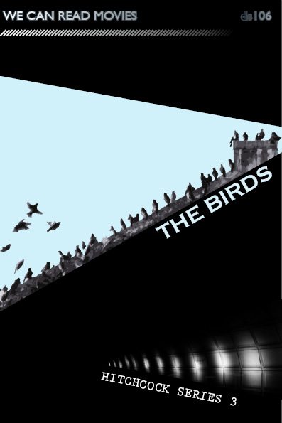
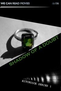
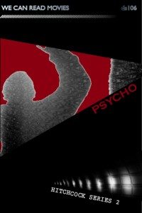
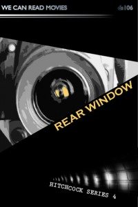
I started by making the basic book design for the we can read movies series. I then tried to establish a feel for the Hitchcock series, which needs a feeling of suspense… I followed some hints from Cheryls blog post about design – using the triangles, the diagonals and the dark background. I used one graphic for the series to pull them together. This was actually a photo of a tube station and I think the diagonal lines of light establish tension too.
It was really hard with Hitchcock to not go with the obvious but what I wanted to do was use my own photos where possible and to add effects in Photoshop to make them more like a graphic. I used the artistic filters cutout in the main and it was interesting playing with that. Very hard not to use birds for The birds and I tried not to but found a photo taken on hols where we a roof was covered. This is probably one of my favourites as I worked the rooftop to align with the triangle edge. I had to use someone else’s photo (thank you baileyclark for using a CC licence) for Shadow of a doubt as I wanted to use an emerald ring and don’t have one. The ring is central to the story, highlighting the tension between the relationship of Charlie and her uncle and also being a crucial clue to his involvement in the murders. I tried to have one colour in each main photo so that I could colour pick it for the title text.
It took blooming ages but now we are planning a film noir series, possibly a sci fic series, and I would like to do more hitch ones. It takes alot of time but has stimulated some great conversations in the family about what key image/icon could be used to convey a film and has made me re-discover some of my old images and play around with them…
I love ds106 for this assignment alone. Even though i have fallen behind on the visual and design assignments and have only just started thinking about audio assignments – we will definitely be continuing to work through the whole summer of oblivion.


Man, I hear you on falling behind, but this series is amazing and is inspiring me to get off me butt tonight and makes some art. I love the Birds one too, and the tube station image is very “cinematic” it’s like you designed your own film series covers, how cool is that. And I have to say I love the way you make the assignments your own. Looking forward to the Noir, scifi series—want to see which ones you choose. The beauty is always in the choice.
thanks Jim – the beauty is in the choice I agree and so is the agony; )
I love these designs! Reminds me of those penguin classics, where they paid some designer a pittance to create the generic layout, then just changed up the image on each one….these all seem like something you could easily find on the bookshelf. I especially like the way you incorporated the roof line of the building with the birds into the design.
I’d love to know how you feel about InDesign. Thus far I’ve played with both Photoshop and Illustrator for ds106, but have yet to venture into other applications.
Thanks Ben
this assignment was out of my comfort zone really so I’m fairly pleased with them but with a hint of undelrying disatisfaction. I think I made it hard for myself by wanting to use my own photos… I may try to lighten up with my next series.
I was surprised that i found InDesign really intuative – probably because I am aleady familiar with photoshop. I didn’t have to search for a tutorial or use the help feature. In the distant past I had used Pagemaker so that may have helped.
I found the text manipulation aspects really easy and enjoyed the complete control this gave. I was surprised how easy I found it.